Crafting a brand that feels like a deep breath
Client
Yogavibe
A Yoga studio in Sydney that unites body and soul
Goals
Align the brand with the studio's
growth and evolution
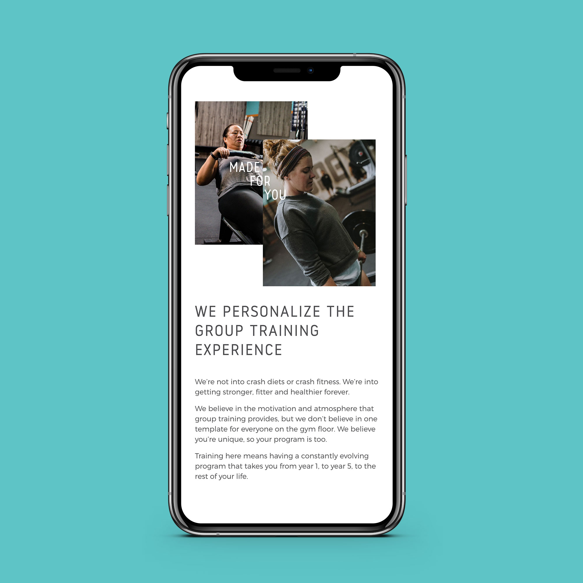
We created
Clear Brand Workshop
Logo Design
Brand Identity
Website
It had been 9 years since Vivienne opened her doors and brought Yoga to Wetherill Park. After nearly a decade of bringing the good vibes, Viv had grown and so had her studio. A new identity was required to align what Yogavibe had evolved into and how it was represented in the market.
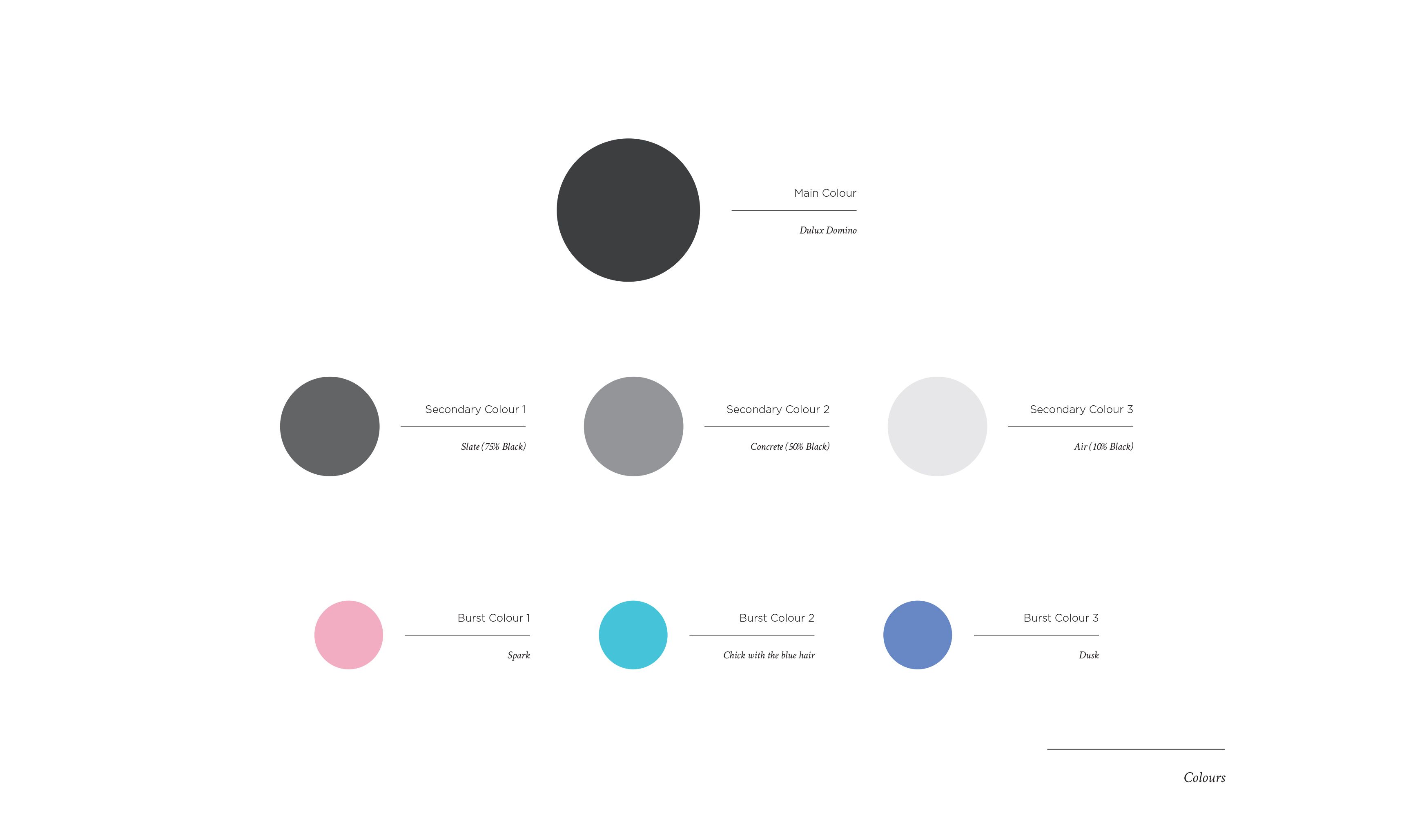
Timing the rebrand to a revamp of the studio meant that the brand and space would work harmoniously. Dark charcoals were chosen for the colours of the brand and the studio, with lots of clean space and bursts of colour, inspired by the bright personalities of both Vivienne and the Yogavibe members.
The brand vibe
Yogavibe's brand was centred around spaciousness. Inspired by the clear-headed, whole-hearted feeling that Yoga delivers, the brand was brought to life with room to breathe. The colours were chosen to represent the space, which had been painted in deep charcoals and made vibrant through the use of pinks and blues.
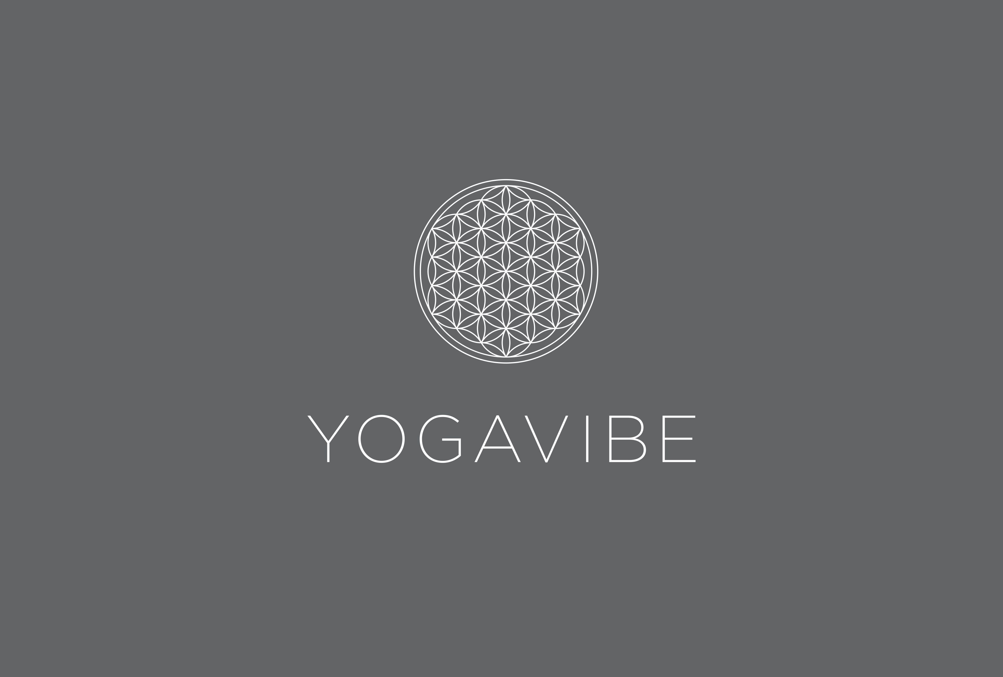
The logo
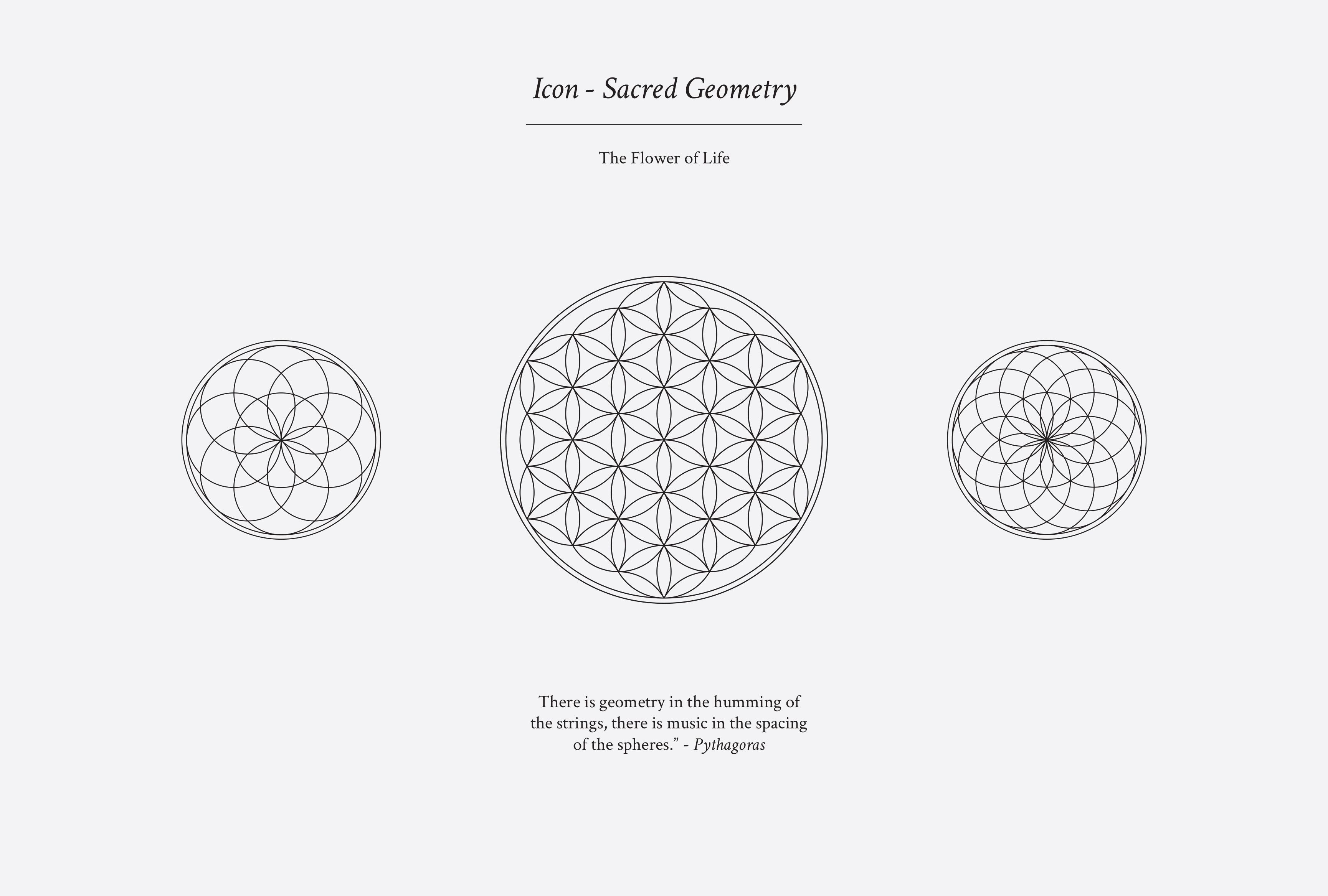
The icon for Yogavibe was to be based on the principles of Sacred Geometry, the idea that nature, random as it may seem, is formed according to divine proportions. The icon chosen to form part of the Yogavibe logo was the flower of life, a motif that instantly communicates alignment and the holistic nature of Yoga, the visual embodiment of coming full circle.
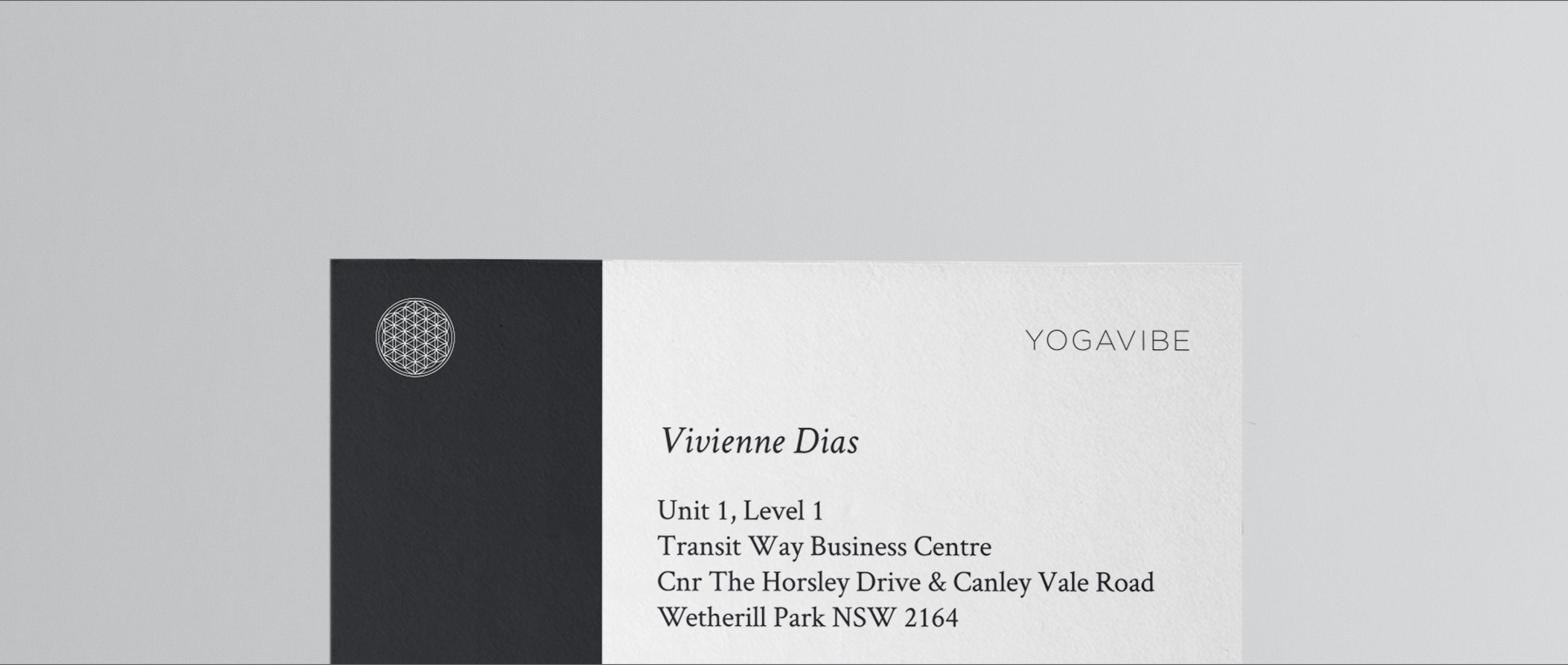
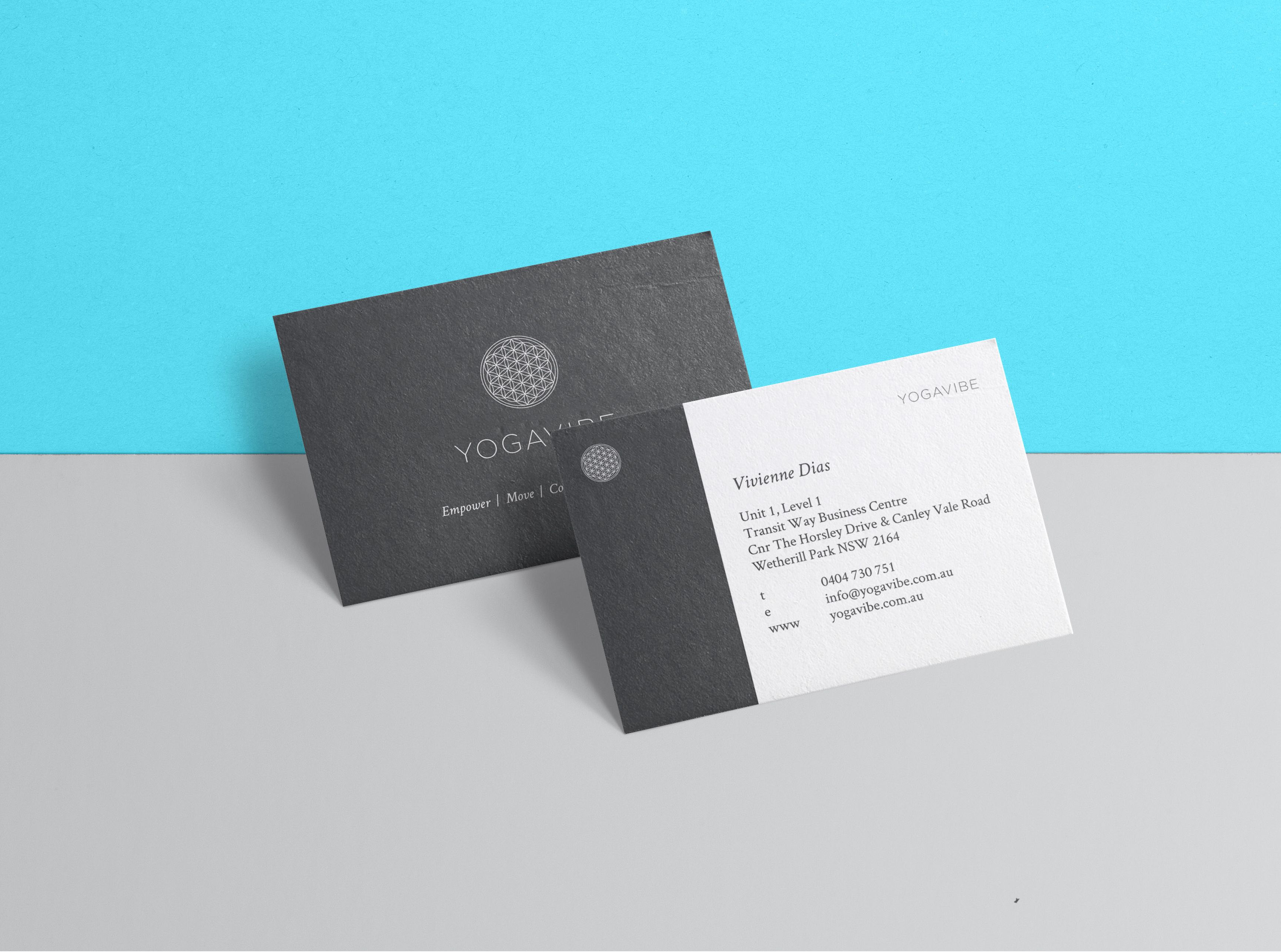
The Yogavibe logo combines the sacred geometry of the Flower of Life with a logotype that allows the letters to breathe while remaining connected. The logotype was constructed to honour the breath and space created through the practice of Yoga and is shown here on a dark charcoal background, which covers the walls of the Yogavibe studio.
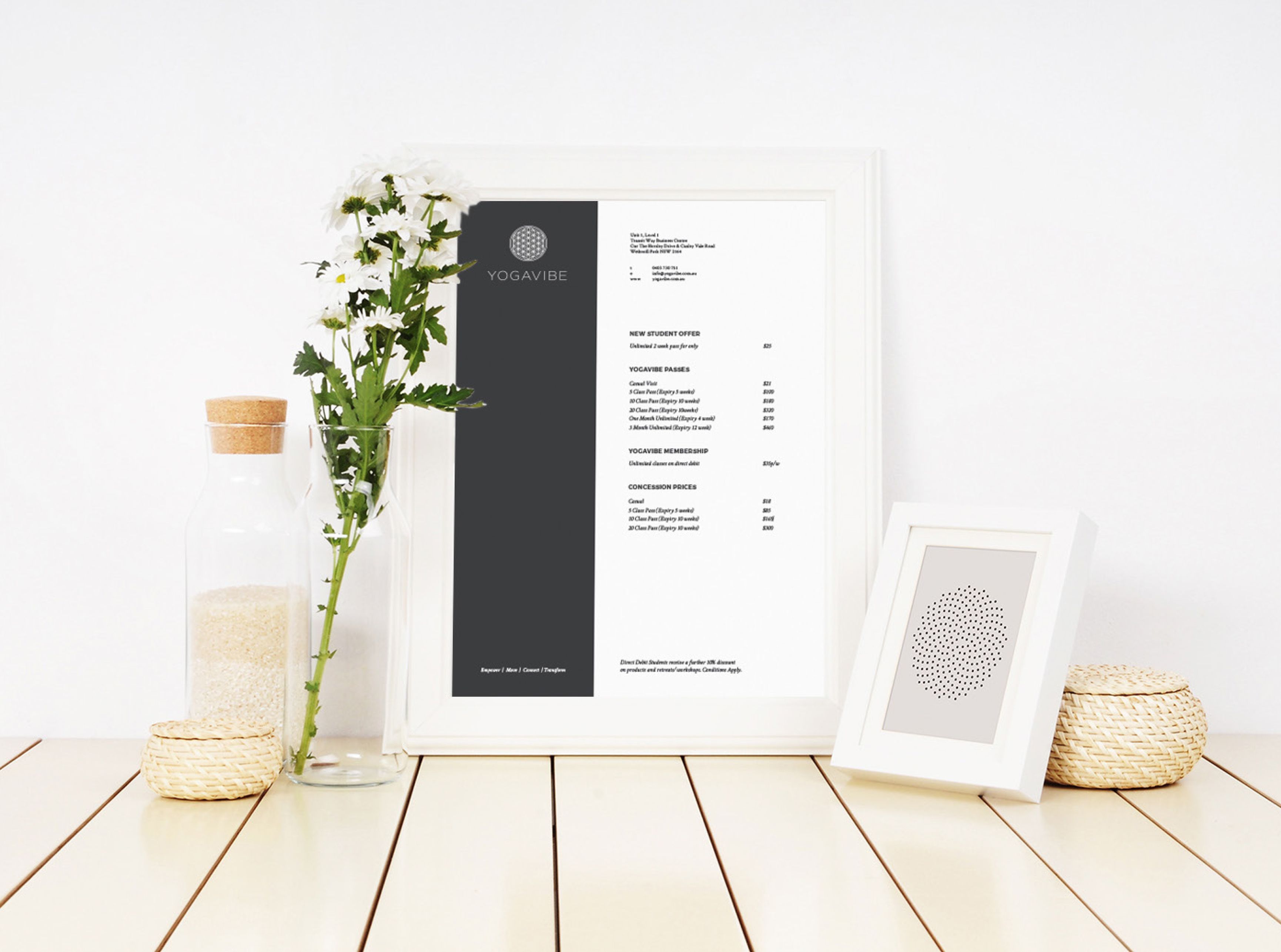
Bringing space to every touchpoint
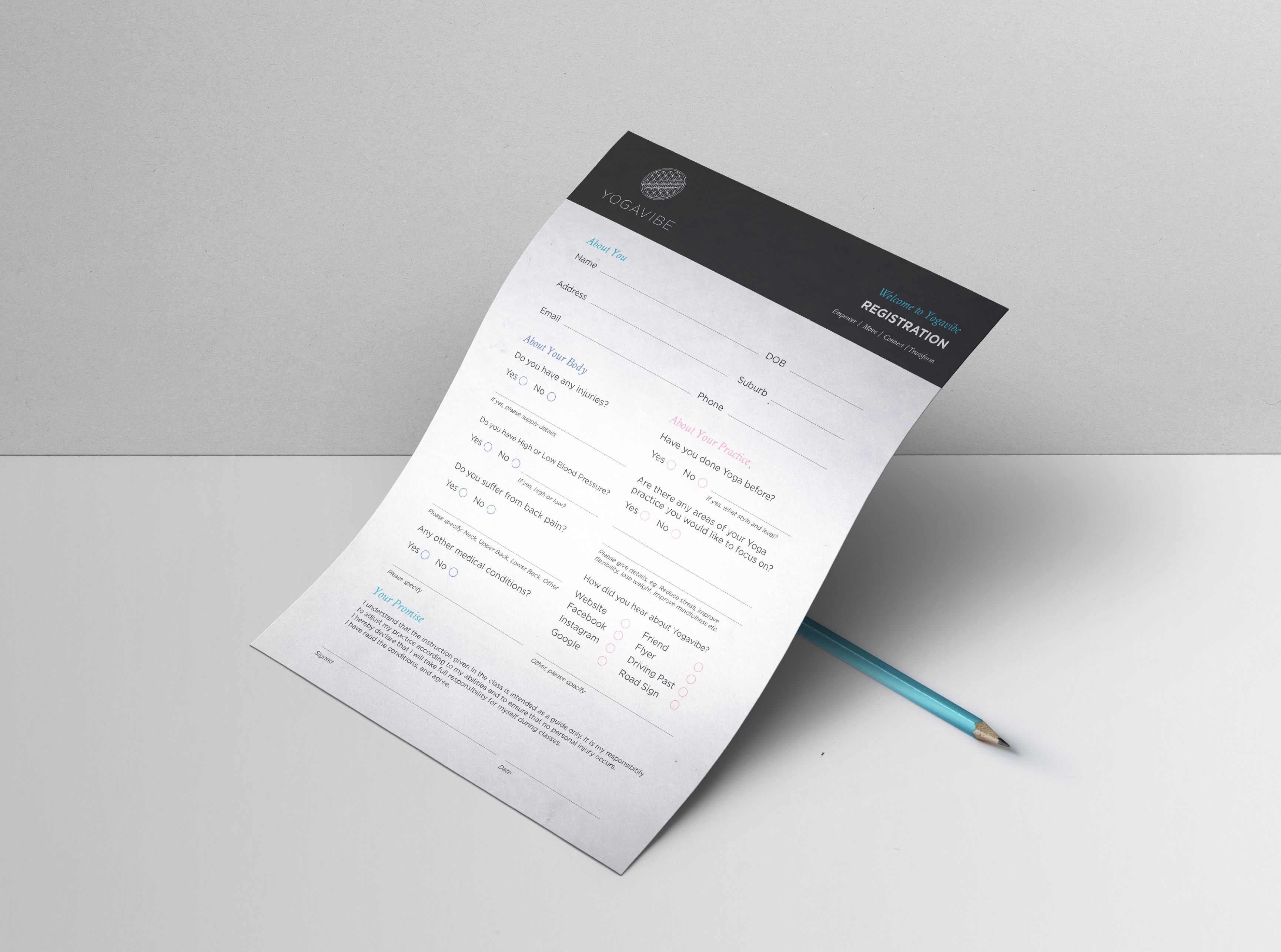
The spaciousness of the brand continues into the rollout and special consideration was given to the layout of stationery, signage and promotional materials.
The rollout phase of a brand is where a business really establishes its look and feel, as it connects to the audience at every touchpoint. From event flyers to waivers and membership forms, the whole experience is considered and designed in a way that communicates space and openness.
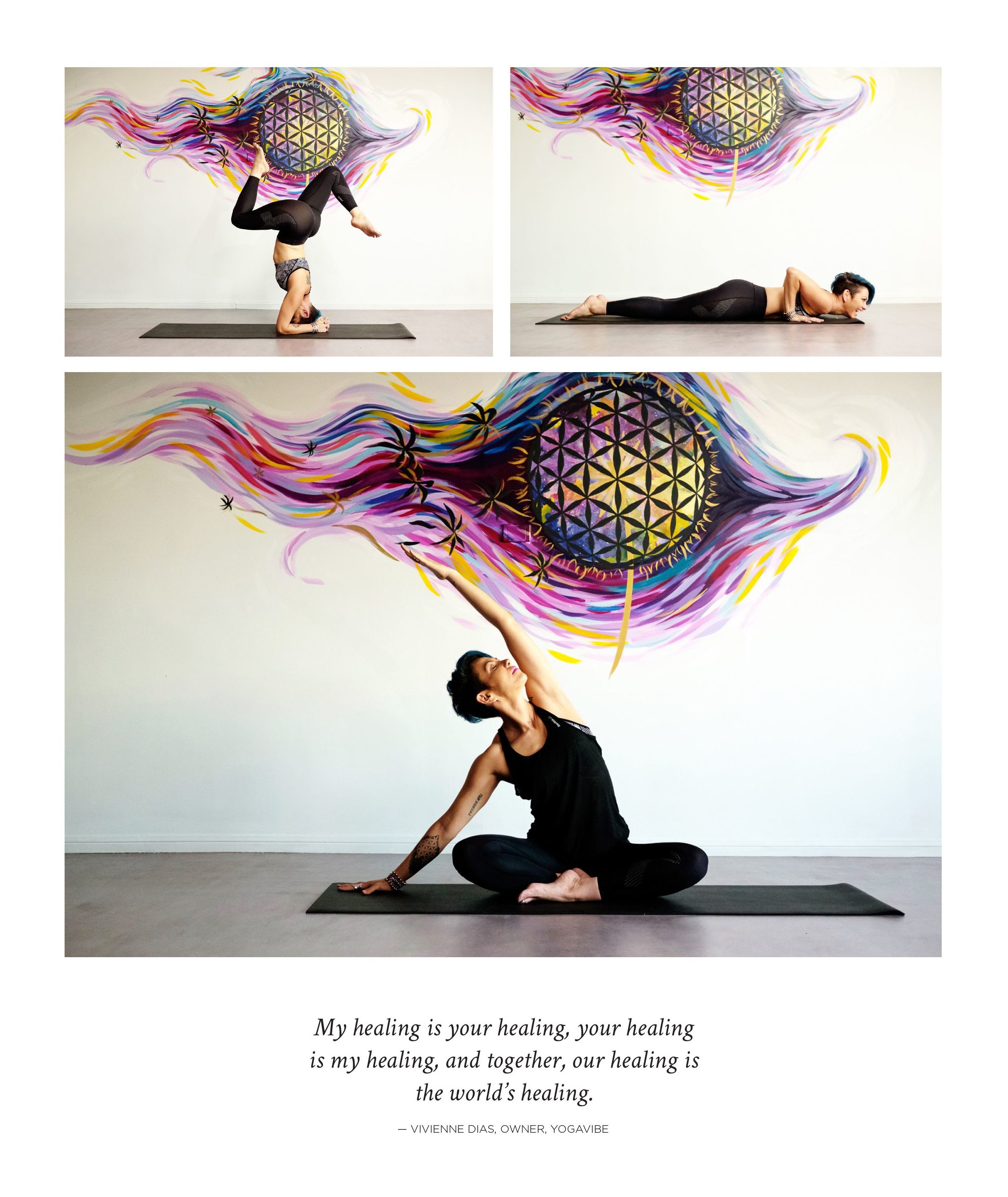
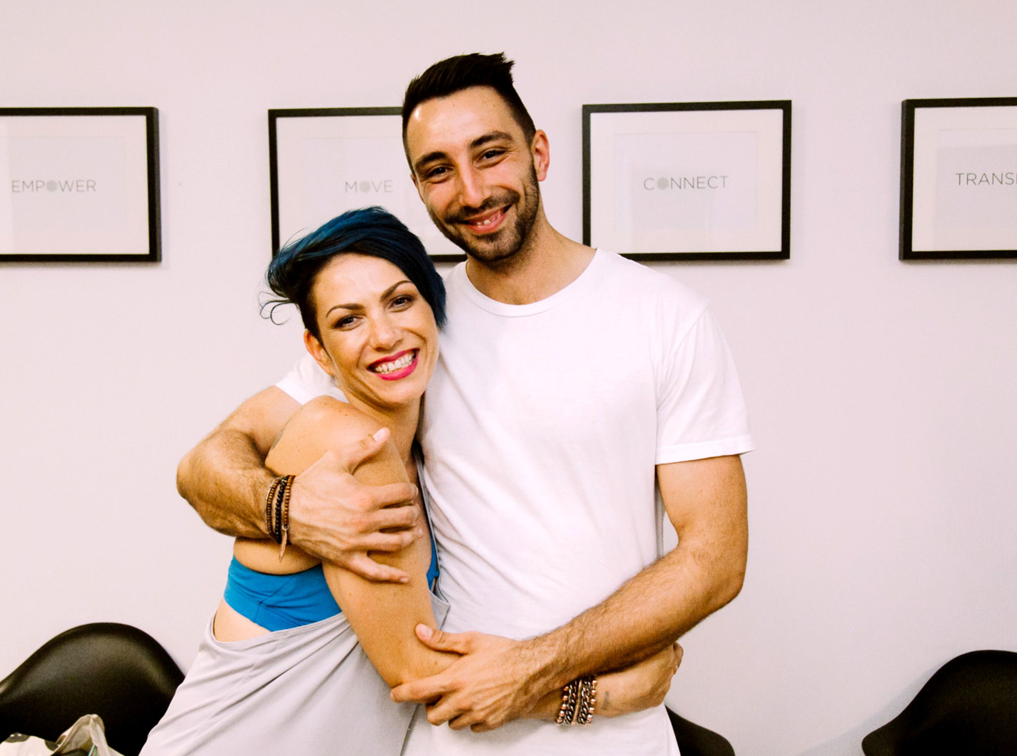
When friends turn into clients and clients into friends
Here’s Viv and me, celebrating the launch of the refurbished studio and the new brand. Together we achieved more than either of us could have conceptualised on our own. Designing a brand for your business requires you to first bare your soul, then trust someone to bring it together and out into the world. It was an honour to have brought Viv’s vision to life, and I love it when friends turn into clients and clients turn into friends. My motto is to keep the brand tight, and the hugs tighter!
More good work for good people
Big Dawgs BrandingBranding
Urban MVMNT BrandingBranding
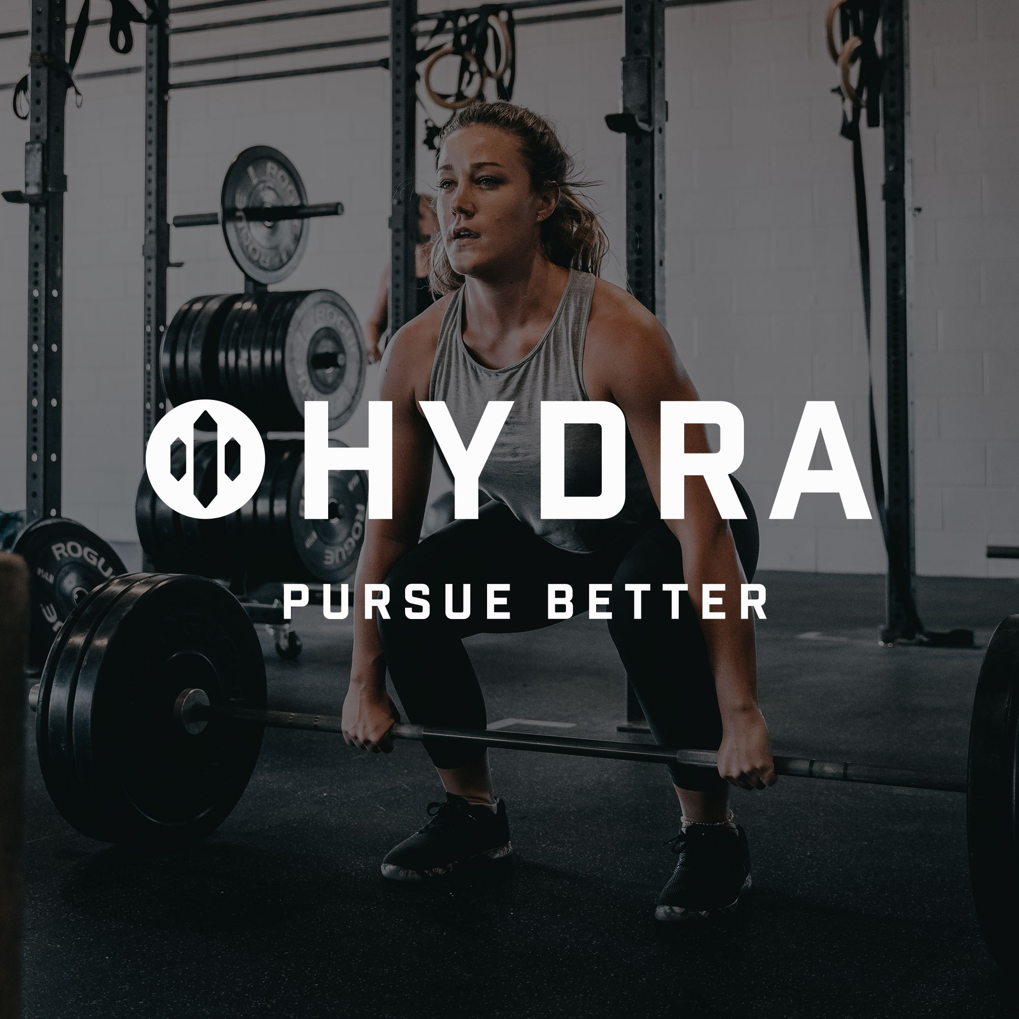
Hydra BrandingBranding
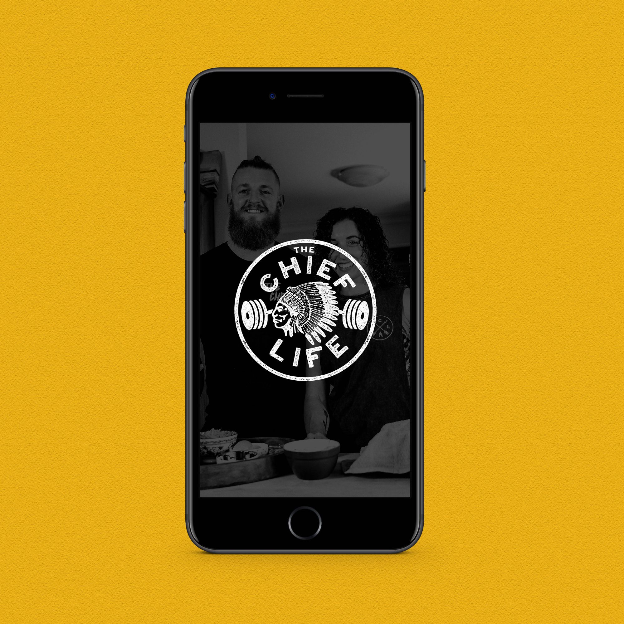
The Chief Life WebsiteWebsite
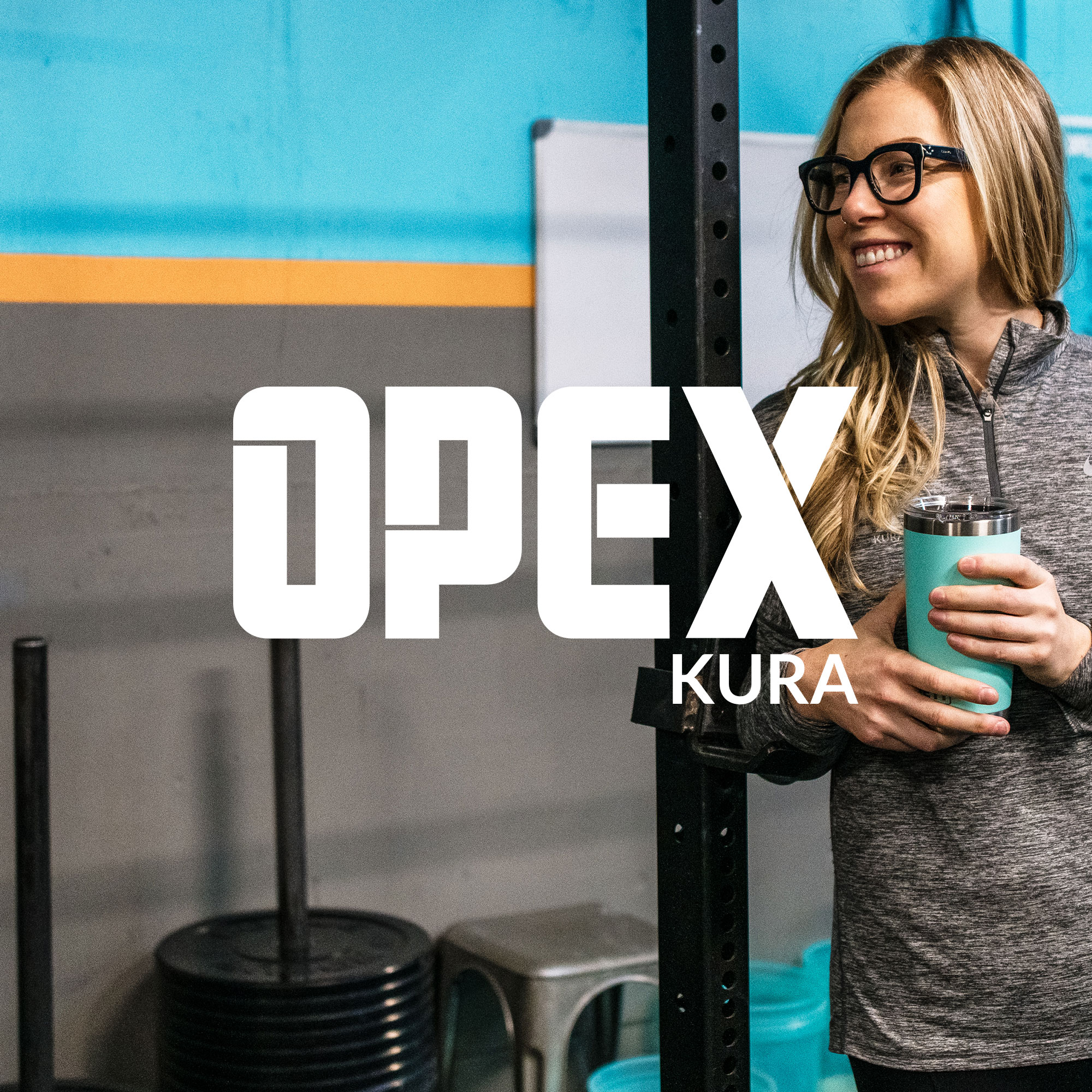
OPEX KURA BrandingBranding
OPEX Gyms Brand EvolutionBranding
OPEX KURA WebsiteWebsites